

Overview
Luvrgrrl is a media review brand rooted in emotional expression, personal storytelling, and a bright, joyful personality. The client wanted the identity to feel soft and tender while still radiating vibrant happiness. My role was to translate that emotional direction into a complete visual identity system that could thrive across digital platforms, especially social media.
Challenge
The brand needed to balance:
A sense of emotional softness
A vibrant, energetic personality
A visual language that could support content-heavy layouts
A distinctive, memorable aesthetic that felt personal and expressive
The identity had to feel heartfelt and approachable, yet bold enough to stand out in a crowded media landscape.
Approach
I focused on building a visual language that blended gentle forms with energetic accents. Every design decision, from typography to color to illustration, was guided by the tension between softness and vibrancy.
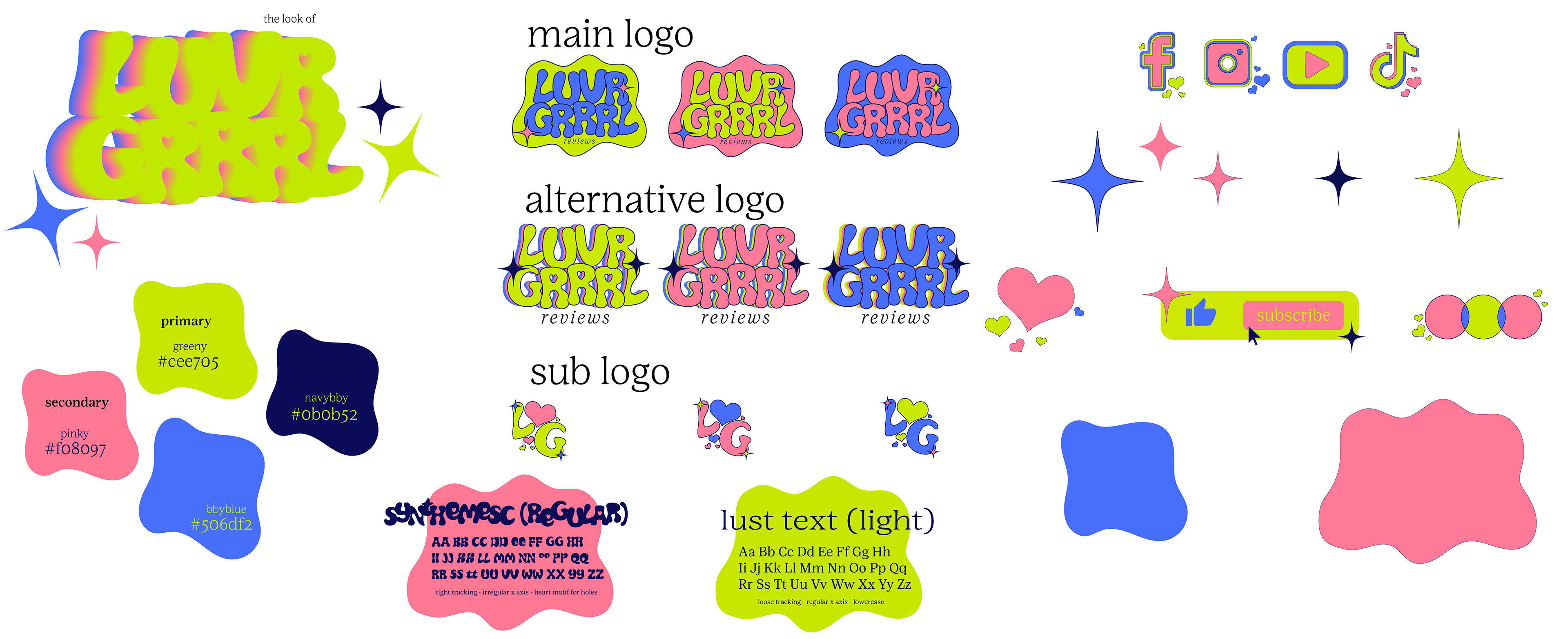
Logo Design
The Luvrgrrl logo centers on:
Rounded, friendly letterforms that convey warmth and softness
Playful proportions to reflect personality and charm
A subtle heart-inspired motif that nods to the brand’s emotional core
I created a few variations of the logo to ensure strong recognition across platforms.
Color
The palette is built around a mix of soft and electric tones:
Dusty pink: the emotional anchor, soft and warm
Neon green: a vibrant, energetic counterpoint
Navy blue: grounding, stabilizing, and essential for contrast
Baby blue: light, airy, and supportive
Together, these colors create a system that feels both tender and bold. The neon green injects a sense of joy and playfulness, while the navy keeps the palette balanced and versatile.
Type
The type system uses a rounded sans-serif base to maintain approachability and softness. While I did not design the typeface itself, I customized it extensively to make it uniquely Luvrgrrl:
Heart-shaped cutouts appear in select letters
Modified counters and terminals add personality
The overall rhythm feels warm, expressive, and unmistakably on-brand
These customizations give the typography a signature emotional quality that ties directly back to the brand’s core themes.
Illustrations
The illustration system is bright, vibrant, and full of movement. It incorporates:
A wavy checkerboard pattern using all brand colors
Soft, organic shapes
High-energy compositions that feel joyful and expressive
A strict use of the brand palette to maintain cohesion
The wavy checkerboard became a key visual motif, playful, dynamic, and instantly recognizable. It adds texture and personality to layouts without overwhelming the content.
Social Media Application
For the social media component of the identity, I focused on creating posts that felt conversational, visually inviting, and aligned with Luvrgrrl’s emotional tone. Each post uses contrast, bold color moments, and clear visual cues to encourage engagement. The prompts themselves (“What are you watching?”, “New review coming soon”, and “What’s your favorite medium?”) were chosen to spark interaction and build a sense of community around the brand. By pairing these prompts with consistent typography, iconography, and color usage, the posts feel both playful and intentional, reinforcing Luvrgrrl’s personality while guiding users toward meaningful participation.
Outcome
The final identity system gives Luvrgrrl a distinctive, emotionally rich visual presence. It balances softness with vibrancy, grounding with playfulness, and personality with clarity. The result is a brand that feels heartfelt, joyful, and unmistakably unique, perfectly aligned with its mission of sharing personal, expressive media reactions and building a community around them.