


Overview
To Dos is a mock restaurant brand that needed a refreshed digital experience, one that felt more intuitive, more visually aligned with its identity, and more supportive of real user needs. I created a full UI/UX redesign presented through a structured presentation, including user stories, low‑fidelity wireframes, a high‑fidelity interactive prototype, and custom digital assets built from the brand’s existing style guide.
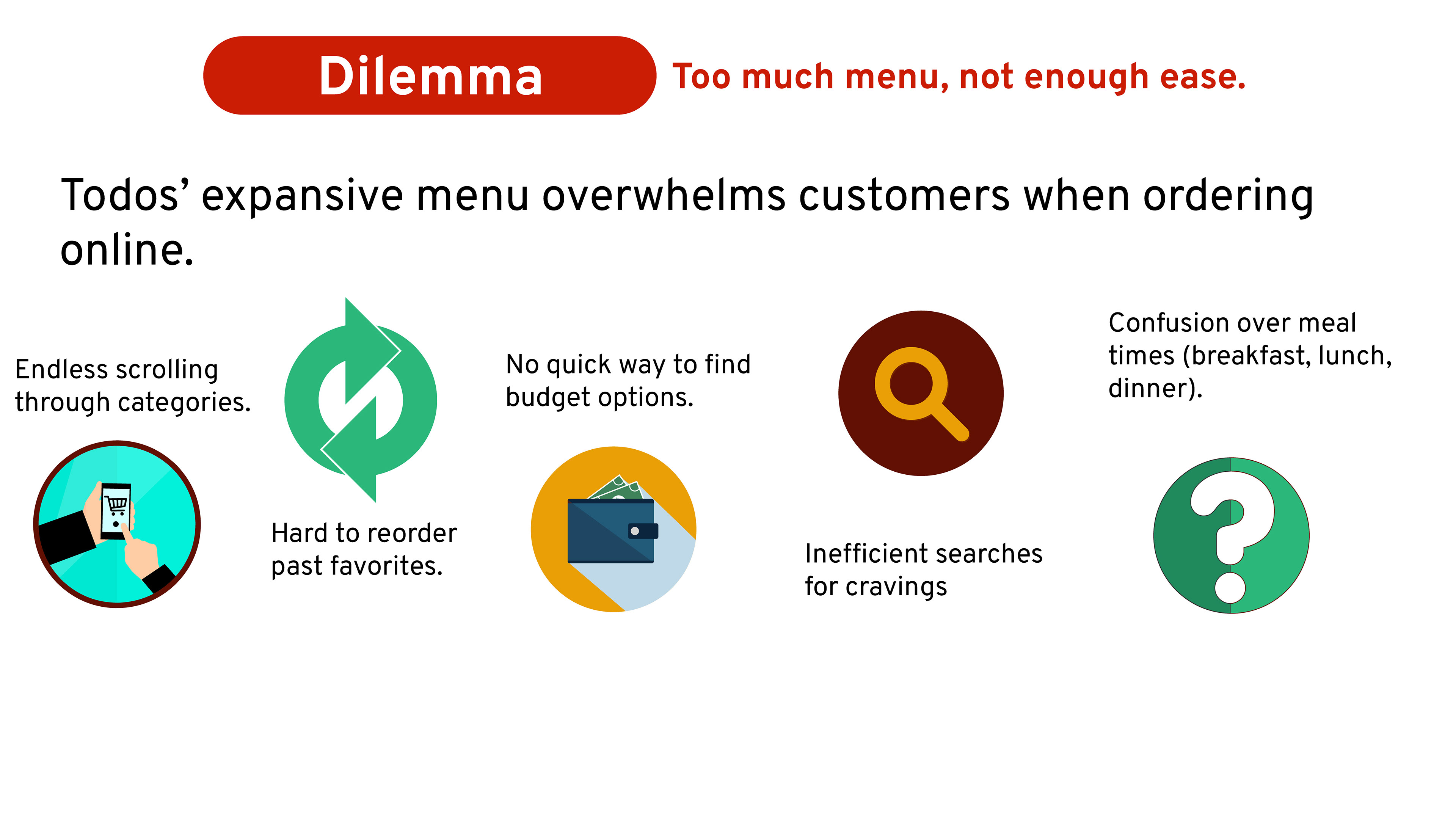
Challenge
The original digital experience lacked clarity, hierarchy, and a sense of personality. Users struggled to complete essential tasks like browsing the menu, placing an order, or finding basic information. My goal was to identify the brand’s core digital challenges and redesign the interface to feel modern, functional, and aligned with To Dos’ identity.
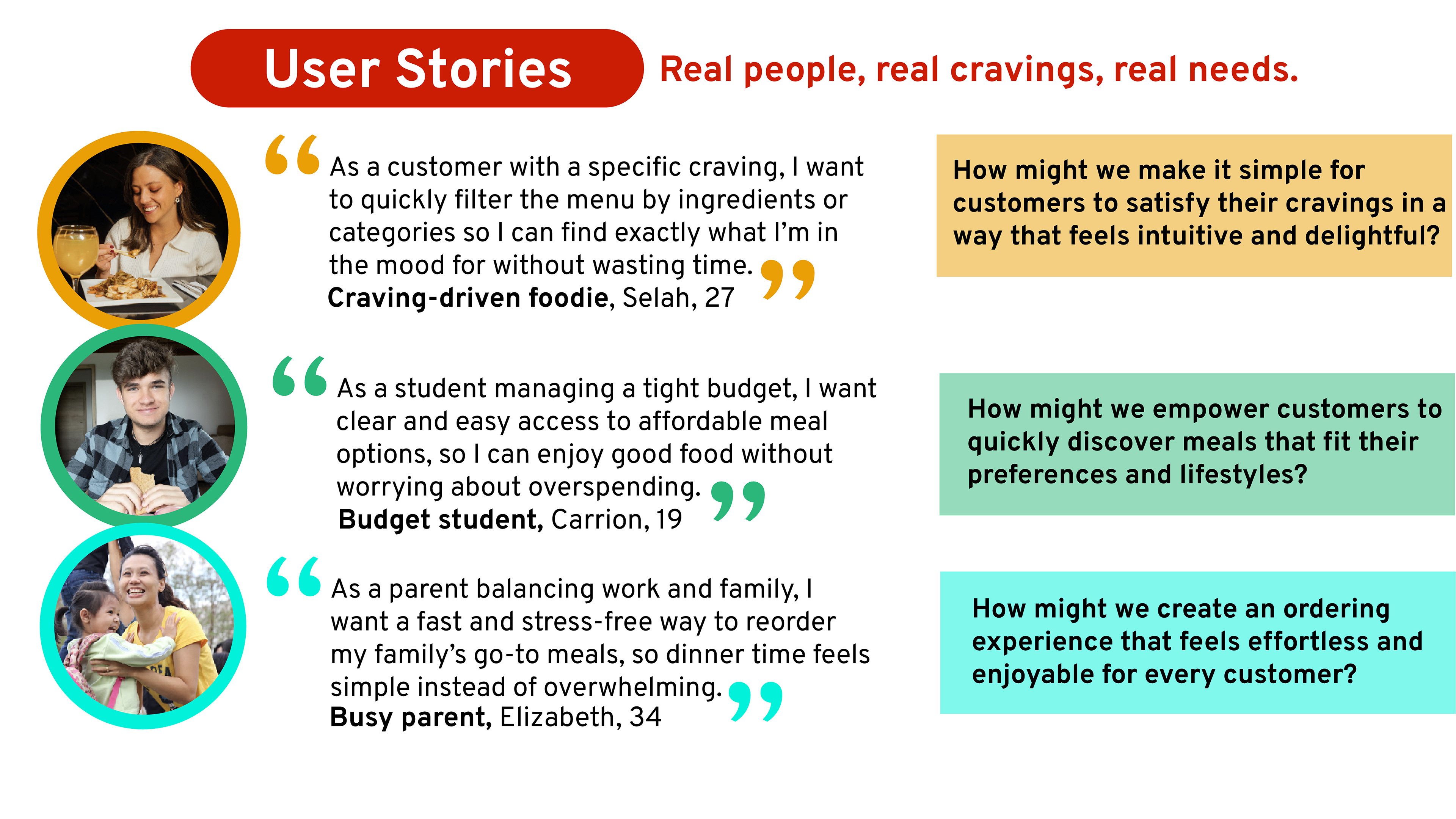
Research & User Stories
I began by outlining key user stories to ground the redesign in real behaviors and motivations. These stories clarified what users needed most from the platform, whether they were exploring the menu, checking hours, or placing an order. This step ensured that every design decision was tied to a clear user goal rather than aesthetic preference.
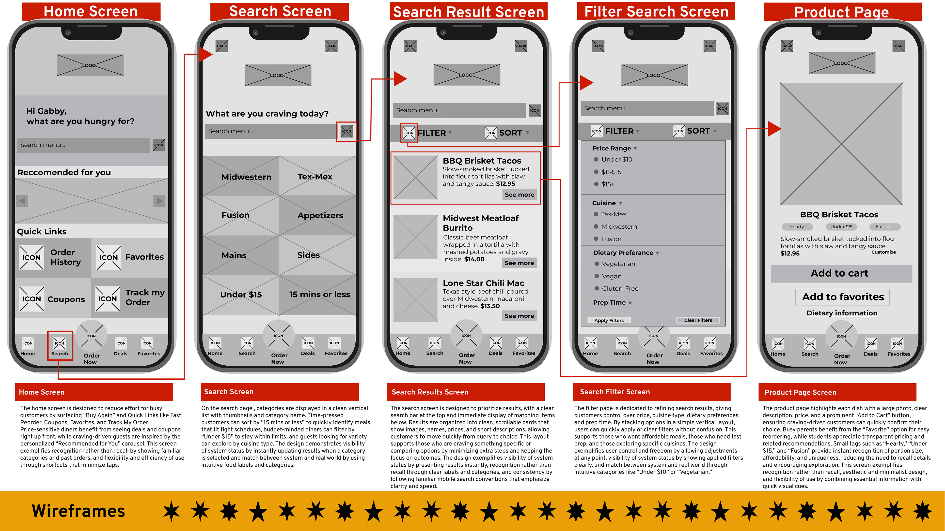
Low-Fidelity Wireframes
With the user stories established, I created low‑fidelity wireframes to map out structure, flow, and functionality. These early sketches allowed me to test layout ideas quickly, refine navigation patterns, and ensure that the redesigned experience addressed the brand’s usability challenges before moving into visual design.
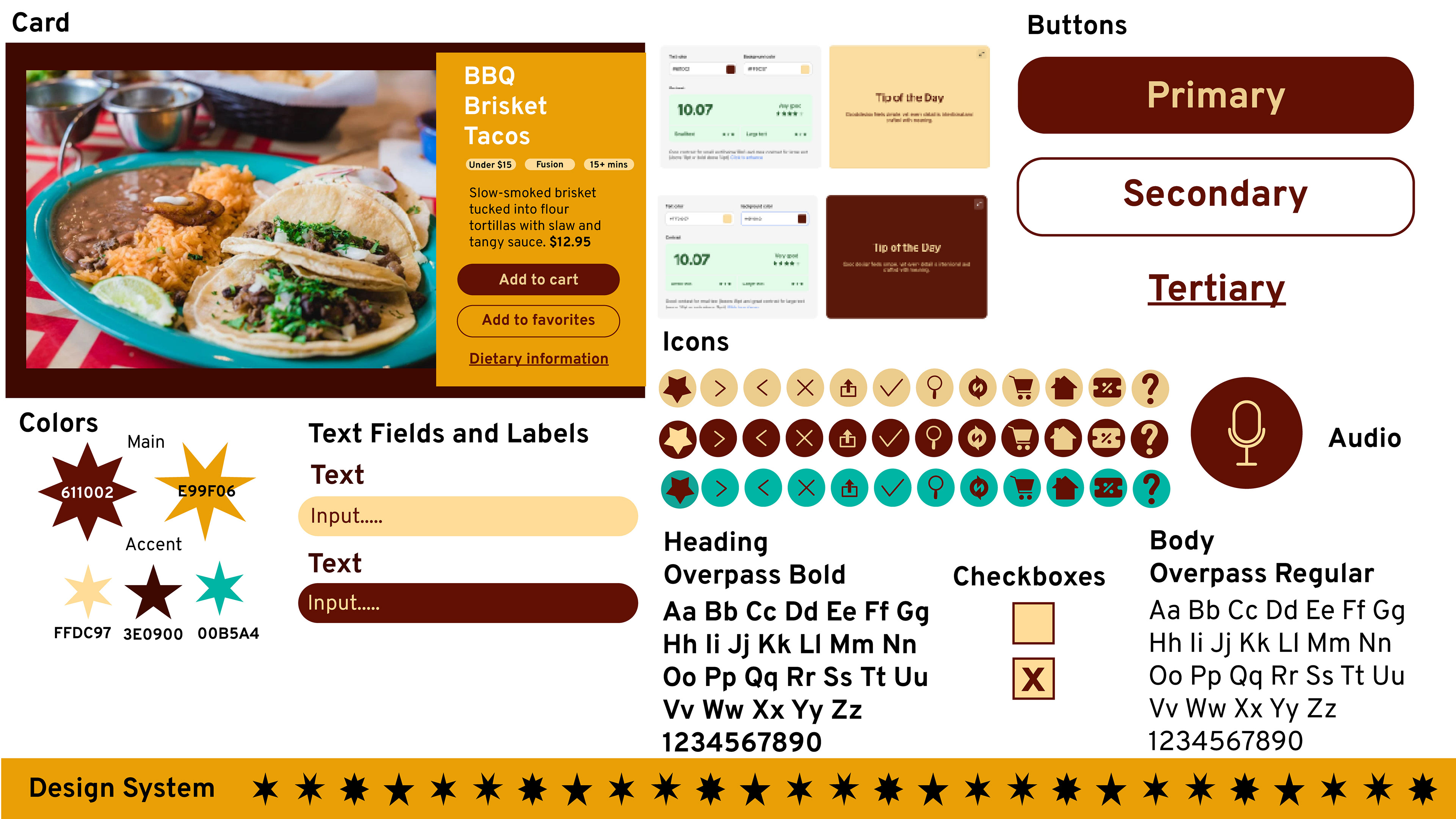
High-Fidelity Prototype
Once the structure was solid, I developed a high‑fidelity interactive prototype that brought the redesign to life. This prototype incorporated:
The brand’s existing style guide
Custom digital assets I created to extend the visual system
A refined color palette and typography hierarchy
Improved navigation and clear calls to action
The prototype demonstrates how the redesigned interface would function in a real‑world context and provides a strong foundation for future usability testing.
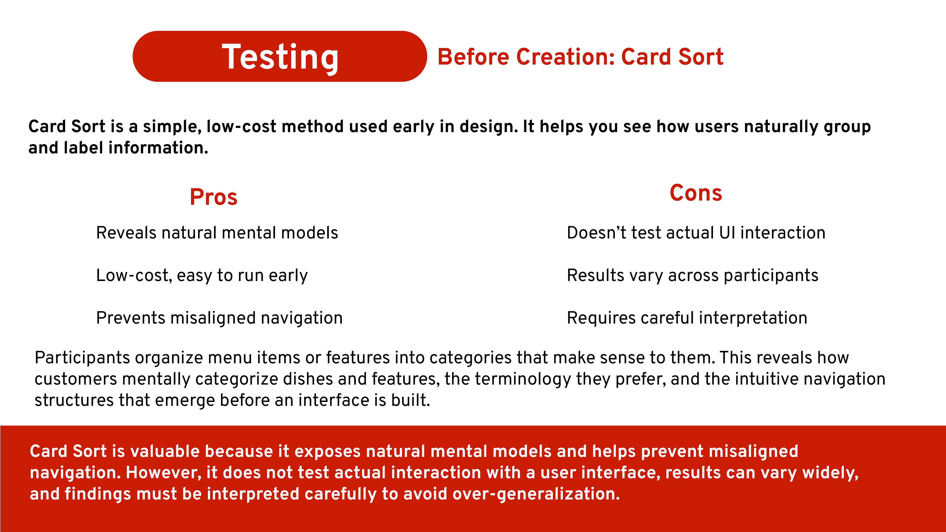
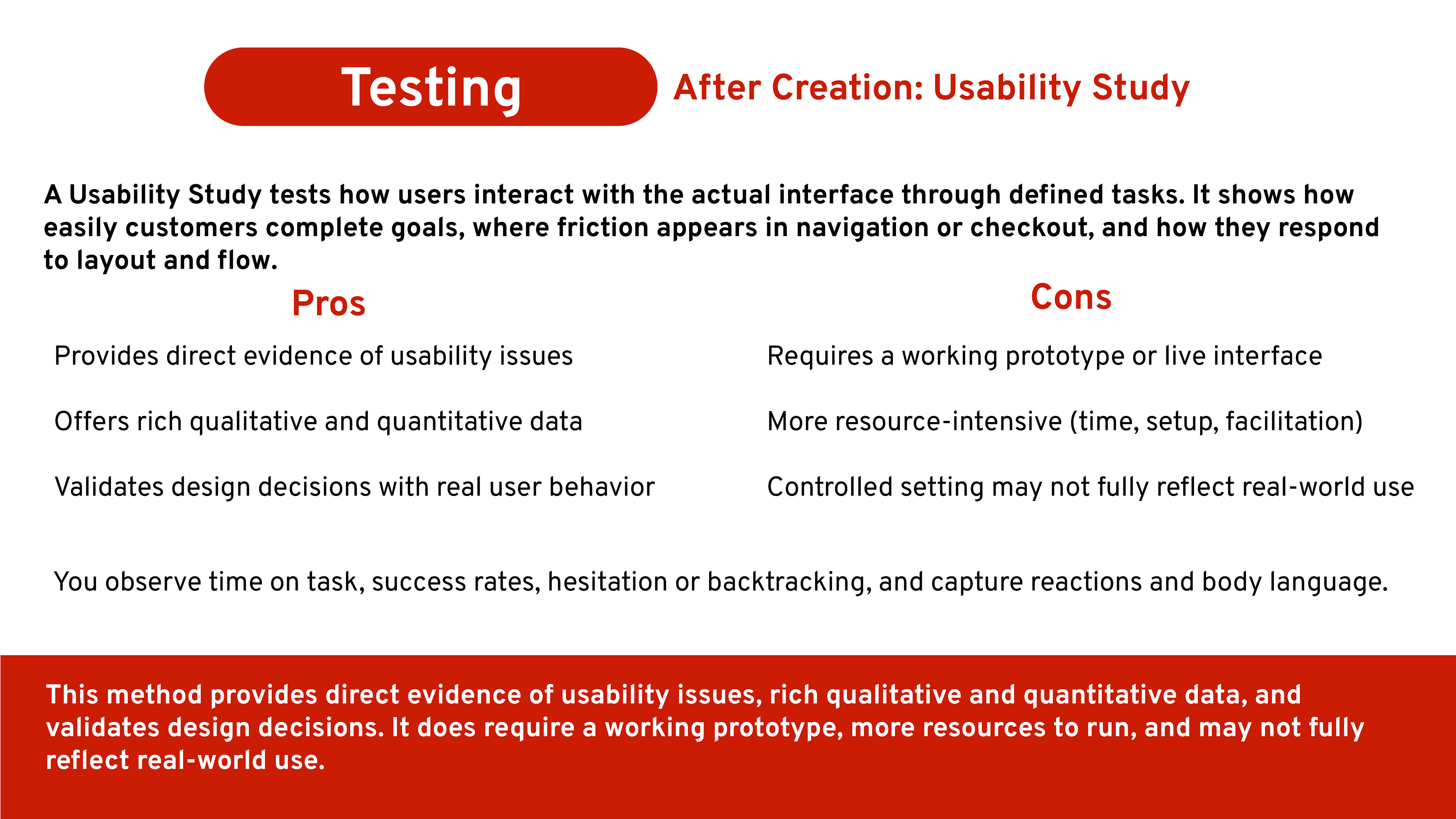
Proposed Testing
While this project did not include formal user testing, I outlined a plan for how the redesign could be evaluated through before‑and‑after testing. The goal would be to gather feedback on:
Task clarity (e.g., how easily users can place an order)
Navigation flow and menu structure
Visual hierarchy and readability
Overall user satisfaction
These proposed tests would help validate the redesign and highlight opportunities for further refinement.
Outcome
This project showcases my ability to approach UI/UX design holistically, from identifying user needs and defining the brand’s challenges to creating wireframes, prototypes, and polished digital assets. The final redesign is cohesive, intuitive, and visually aligned with To Dos’ identity, demonstrating my capability to build thoughtful, user‑centered digital experiences from the ground up.