Overview
For this project, I developed a full suite of materials for a mock global design conference focused on expanding educational access for girls worldwide. My goal was to build a visual system that felt unified across every touchpoint while still allowing each piece to serve its own purpose. To do that, I combined edited raster imagery with custom vector illustrations, blending realism and graphic expression in a way that felt both human and hopeful.
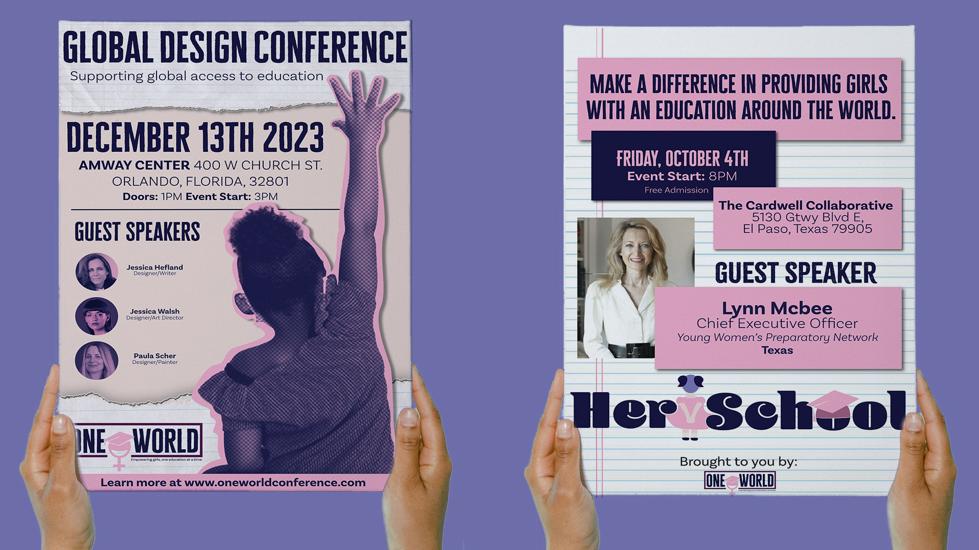
The two print ads were designed as complementary pieces, different compositions, different focal points, but unmistakably part of the same visual family. They introduce the conference’s mission with clarity and emotional resonance, using consistent color, typography, and illustration motifs to tie them together.
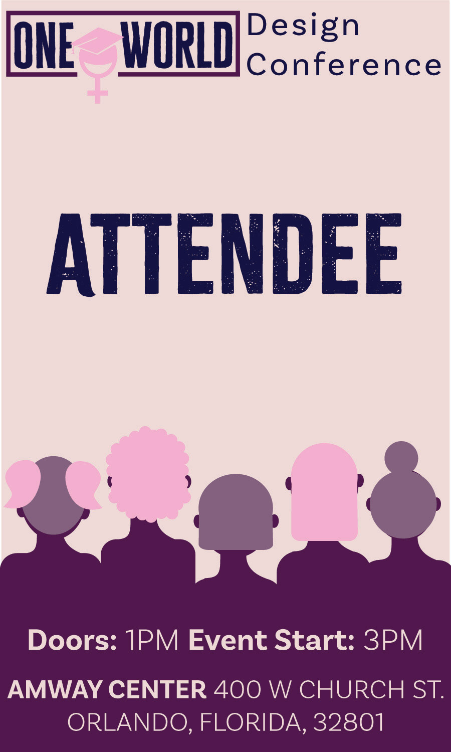
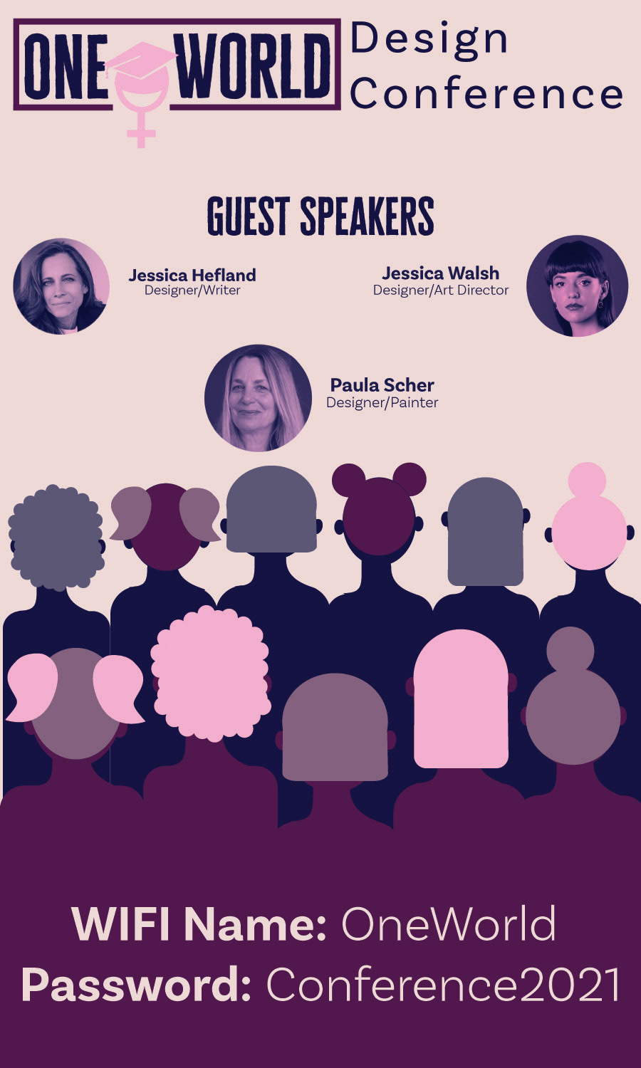
From there, I translated the identity into attendee badges, treating them as small but meaningful extensions of the brand. They needed to be functional, readable, and instantly recognizable, so I distilled the visual language into a compact format that still carried the conference’s energy and purpose.
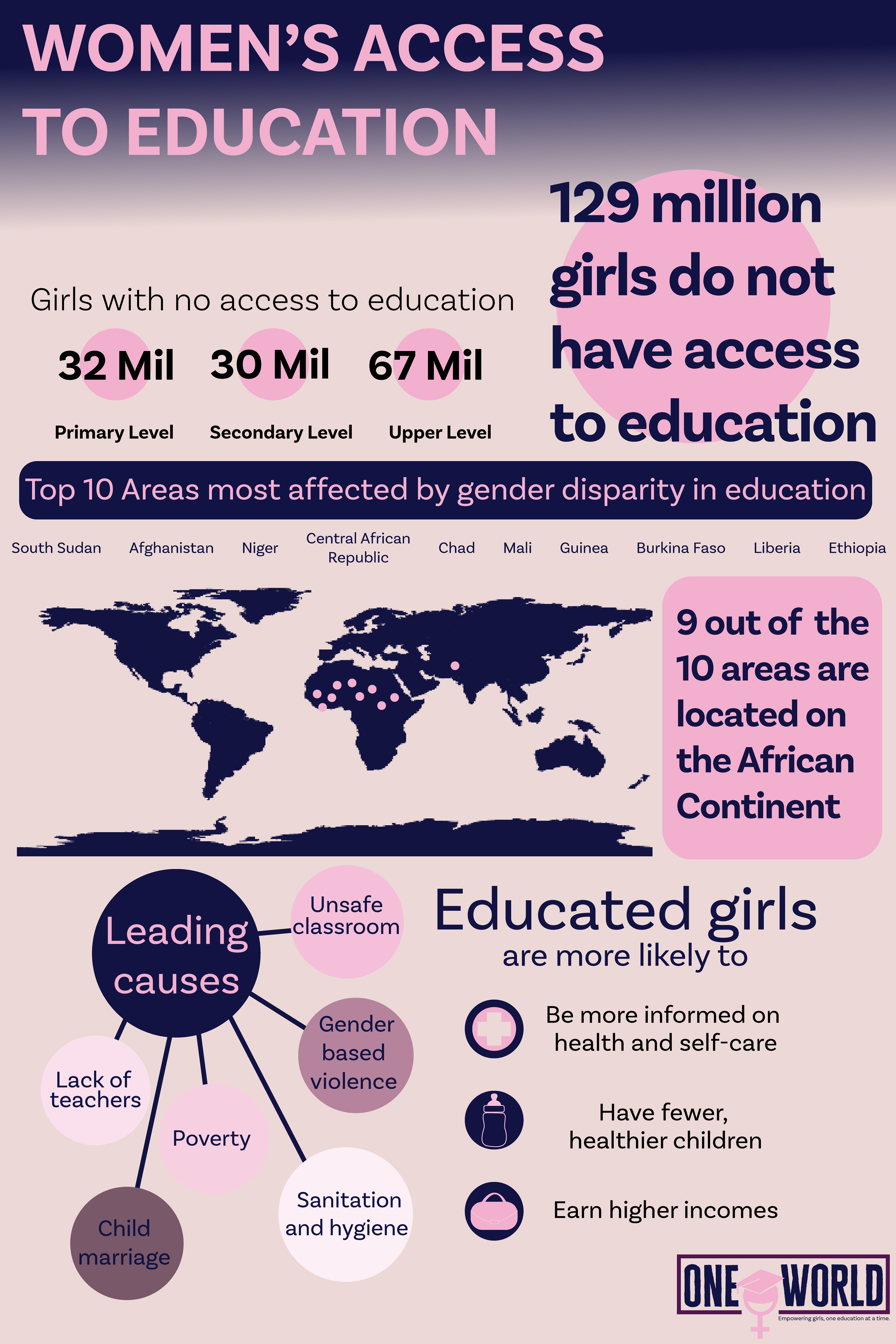
To round out the system, I created a digital infographic that explains why the conference matters. It uses the same visual vocabulary to present global education statistics in a way that feels accessible and engaging, reinforcing the urgency behind the event’s mission.
Together, these pieces demonstrate my ability to create cohesive, consistent designs across multiple mediums, each one visually distinct, yet all speaking the same language and supporting the same story.